![[User Posted Image]](https://prodimage.images-bn.com/pimages/9781945683985_p0_v4_s1200x630.jpg)
post your reviews here!
Overview
Total Pages: 288 -- all in full color
Book Sections:
- Forward
- Introduction
- Spyro
- Heroes and Villains
- Dragons
- Friends and Enemies
- The World of Spyro
- Acknowledgements
- Colophon
Each italicized section starts with a two page blurb, followed by concept art. Occasionally, the concept art will be accompanied by quotes from the people involved in the design process.
Pages are smooth and glossy. Print quality appears to be good. I didn't notice any printing errors.
The book has a hard cover with a beautiful illustration.
The inside cover also has a nice illustration of a dragon statue in the Artisan homeworld.
Thoughts
On text-based pages, the background is dark purple with a swirl pattern, which helps to make these sections more visually exciting. The text, however, is black, and blends into the purple somewhat, which might make reading difficult for some people.
The book is written with a somewhat playful tone that I think works with the feeling that this version of Spyro is trying to evoke.
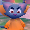
Some of the earlier concept designs are in the book! It looks like some designs besides Oswin got moved from level to level. I love how artists were encouraged to think of a backstory for characters and levels, it really comes through (especially for Spyro 1) in the art and the game.
There is mention of an art bible that Toys For Bob drafted for internal use. I'd love to get my hands on one some day! The design philosophy is described in the introduction of the artbook; later it describes that the art style is meant to be wonky, which I think is a good way to describe its playfulness.
Right before the introduction is an illustration of Delbin and Spyro painting. The last couple of pages are dedicated to Spyro hanging out with the rest of the Artisans. There's a cute little story about why this series was made. One of the artists started out with the Gildas illustration, which was well-received, so the rest were made.
Nitpicky Errors that I Noticed Because I'm a Snob
- Hunter on the cover is missing his cheetah tear marks
- Misnamed dragons
- Improperly labeled levels
These really aren't very big problems. I was concerned more things would be mislabeled, but I only noticed 2 or 3 instances of this. It's really not all that bad, and is a reminder of how complex the process of gathering information for an artbook must be.
TL ; DR
Was worth the cost to me. I found the book inspirational for my own artistic practice, and enjoyed it for the most part. It feels like there was a lot of care put into the work, despite some naming problems. I hope this will provide some of the artists with good job opportunities in the future!


 darkspyro
 net
net